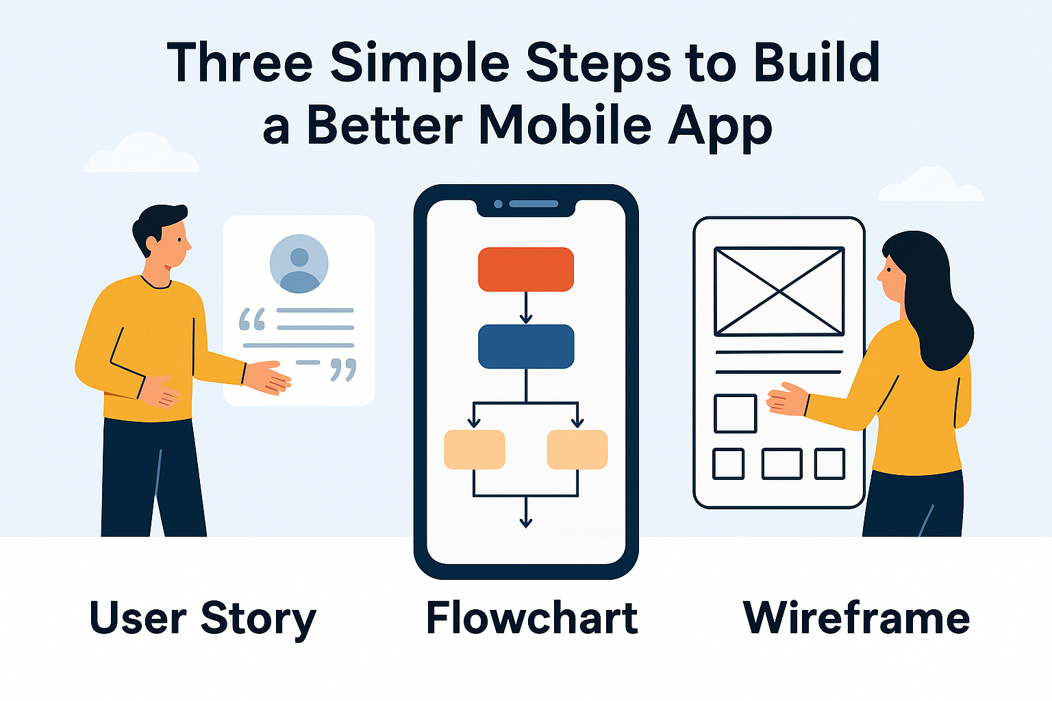
Three Simple Steps For a Better Mobile App using User Story, Flowchart & Wireframes

I’ve seen it happen way too often—someone comes up with a great idea for a mobile app, starts building it, and halfway through, everything falls apart. The screens don’t make sense, the developer isn’t sure what’s supposed to happen next, and the user experience? Confusing at best.
But the truth is, most of this can be avoided with three simple planning tools: user stories, flowcharts, and wireframes. These aren’t just for big agencies or UX teams. I’ve used them on solo side projects, client builds, and even quick MVPs. And when done right, they make the entire development process smoother, faster, and way less stressful.
Let me walk you through how I use these three steps—and how you can too.
Step 1: Start with User Stories (Not Features)
One of the biggest mistakes I see new app builders make is thinking in terms of features instead of users. “It needs a dark mode, a leaderboard, and AI integration.” Cool. But… who is using this? Why? What for?
That’s where user stories come in.
What’s a user story?
A user story is a simple sentence that describes what a user wants to do, why, and who they are. The basic format is:
As a [type of user], I want to [do something] so that I can [get a result].
Here are some examples I’ve written recently:
As a parent, I want to set screen time limits for my child’s device so that I can manage their study time.
As a fitness coach, I want to send push reminders to my clients so that they stay accountable.
As a new user, I want to try the app without signing up so that I can see if it’s worth it.
Why start with user stories?
Because they shift your thinking from “what do I want to build” to “what will actually be useful.” This mindset change is where all good UX starts.
User stories also help:
Prioritize which features matter most
Avoid building things no one will use
Communicate clearly with designers or developers
If you want to go deeper into writing good user stories, Atlassian has a great breakdown that covers formats, mistakes, and team workflows.
Step 2: Turn Stories into Flowcharts
Once you’ve written your stories, it’s time to think through how users will move through the app. This is where user flows—or flowcharts—come into play.
If user stories answer “what should this app do?”, flowcharts answer “what happens when someone tries to do that?”
What’s a flowchart in app design?
It’s basically a map of user actions, usually with boxes and arrows, showing what screen or step comes next based on a user’s input.
Let’s say one of your user stories is:
“As a user, I want to reset my password so I can log in again.”
Your flowchart might look like:
Tap “Forgot Password”
Enter email address
Tap submit
See confirmation screen
Open email and tap reset link
Enter new password
Login success
Each of those steps is a node in your flowchart.
Tools I use for flowcharts:
Whimsical – fast, clean, perfect for app logic
Miro – better if you’re collaborating with a team
Pen and paper work just fine, especially during the early stages of planning app structure.
Flowcharts help you:
Spot bottlenecks before you code anything
Identify missing screens or edge cases
Communicate app behavior clearly to developers or clients
Step 3: Sketch Wireframes (Before You Touch UI Design)
Now that you’ve mapped the logic, it’s time to sketch how the app will actually look. This is where wireframes come in—and no, you don’t need to be a designer to do it.
What’s a wireframe?
A wireframe is a low-fidelity mockup of your app’s interface. It shows layout, navigation, and interactions—without getting distracted by fonts, colors, or branding.
I use wireframes to figure out:
Where buttons should go depends on usability expectations—something top app design workflows prioritize.
What info needs to be on each screen
How to make navigation obvious
How users will interact with each element
How I do it:
Start with sketches on paper – seriously, just draw rectangles and arrows
Move to digital tools like:
Balsamiq – great for quick, low-fidelity layouts
Figma – better if you’re working toward a final UI
Wireframe.cc – for simple solo mockups
When you wireframe after creating user flows and stories, you avoid common design mistakes—like including screens that have no purpose or missing key actions.
Why This Process Saves Time (and Money)
Most app failures happen not because of bad code—but because of unclear planning. The best way to avoid that is to front-load your process with clarity.
Here’s what this 3-step method does:
| Step | What You Get | What It Prevents |
|---|---|---|
| User Stories | Real-world use cases | Building features no one wants |
| Flowcharts | Clear app logic and structure | Confusing navigation or dead ends |
| Wireframes | Visual layout of every screen | Design changes during development |
This isn’t just theory—I’ve used this process on client projects that ranged from 5-screen MVPs to enterprise-grade apps. And every time I skipped it, we paid the price later.
Building a mobile app doesn’t have to feel overwhelming. But it does need structure. If you take the time to:
Write clear user stories
Map out your user flows
Design wireframes for key screens
You’ll save yourself from miscommunication, development rework, and a messy user experience.
This 3-step process doesn’t replace design or development—It sets the foundation—something that many apps overlook during launch timing and pay for later.